
Chart of Universal History – Spain
Revolutionizing data visualization in the mid-18th century.
Out of stock

Description
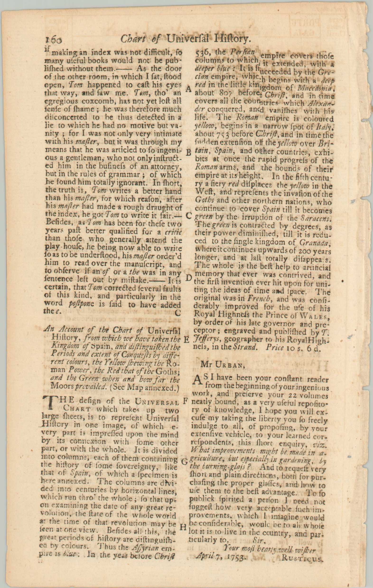
“An Account of the Chart of Universal History, from which we have taken the Kingdom of Spain, and distinguished the Periods and extent of Conquests y different colors, the Yellow shewing the Roman Power, the Red that of the Goths; and the Green when and how far the Moors prevailed (See Map annexed)” – Text, accompanying page.
This fantastic diagram outlining nearly 4,000 years of Spanish history was originally designed in 1753 by the talented cartographer Thomas Jeffreys. It was but a small part of his much larger Chart of Universal History, which attempted to display for easy comprehension the entirety of known history (from an admittedly Western perspective).
The section was published in the April 1753 issue of Gentlemen’s magazine. The related article describes Jeffreys’ diagram as “the best help to artificial memory that ever was contrived, and the first invention ever hit upon for uniting the idea of time and space.” While this is a bit of an overstatement, spacing the chart as a continuous field “directs it to the temporal boundaries of historical entities and events” (Rosenberg/Grafton) and offered a novel visualization of historic data.
Source: Rosenberg, and Grafton. Cartographies of Time. New York, Princeton Architectural Press, 2010.
Map Details
Publication Date: 1753
Author: Thomas Jeffreys
Sheet Width (in): 7.5
Sheet Height (in): 4.5
Condition: B+
Condition Description: Two sheets (chart and text) disbound from a 1753 edition of London's Gentleman's Magazine. Rough edges where formerly bound and some light soiling, The timeline features nice original hand color, with the red fading to brown. Good to very good overall
Out of stock