
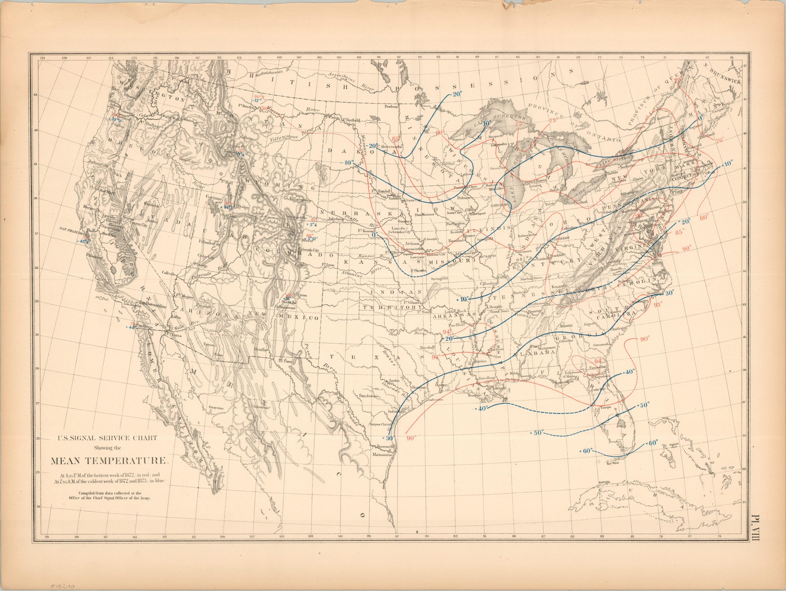
U.S. Signal Service Chart Showing the Mean Temperature
$60.00
America’s highs and lows (temperature-wise) during the Reconstruction Era.
1 in stock
Description
This interesting temperature map of the United States uses red and blue isothermal lines and numbering to identify the mean temperatures across the continent. Data was collected at 4:35 p.m. on the hottest week of 1872 (red) and at 7:35 a.m. on the coldest week of 1872 and 1873 (blue). Temperatures range from twenty below to 94 degrees, though significant portions of the West are without data.
The sheet was originally issued as part of The Statistical Atlas of the United States Based on the Results of the Ninth Census, 1870, compiled by Census Superintendent Francis A. Walker. Lithographed by Julius Bien and published in 1874. The atlas serves as the ultimate 19th-century “data portrait” of a reunified nation, meticulously synthesizing geography, climate, and demographics into a visual manifesto of America’s industrial and economic potential.
Map Details
Publication Date: 1874
Author: Francis A. Walker
Sheet Width (in): 21.75
Sheet Height (in): 16.25
Condition: B+
Condition Description: Lithographed sheet on somewhat brittle paper. Moderate marginal wear including a ragged upper edge, toning, and a few small closed tears
$60.00
1 in stock