Happy V-J (Victory over Japan) Day from Curtis Wright Maps!
Though many consider September 2nd (the date of formal surrender) to be the official anniversary, on August 14th, 1945, (in the U.S.) Emperor Hirohito announced over the airwaves of Japan that he had accepted the terms of surrender issued by the Allies at the Potsdam Conference. Public celebrations began immediately across the United States after President Truman’s announcement that same day. The American homefront had endured over three years of rationing, anxiety, and heartbreak, and at last, the war had finally and conclusively been won!

The preceding 3+ years had been tough; but for many Americans, victory had never been in doubt. The attack on Pearl Harbor galvanized public society against the Axis powers, and most knew it was only a matter of time before they fell. This dogged determination and optimism was fueled by popular cartography published during the war, which often portrayed the struggle through a patriotic lens – as one of inevitable victory.
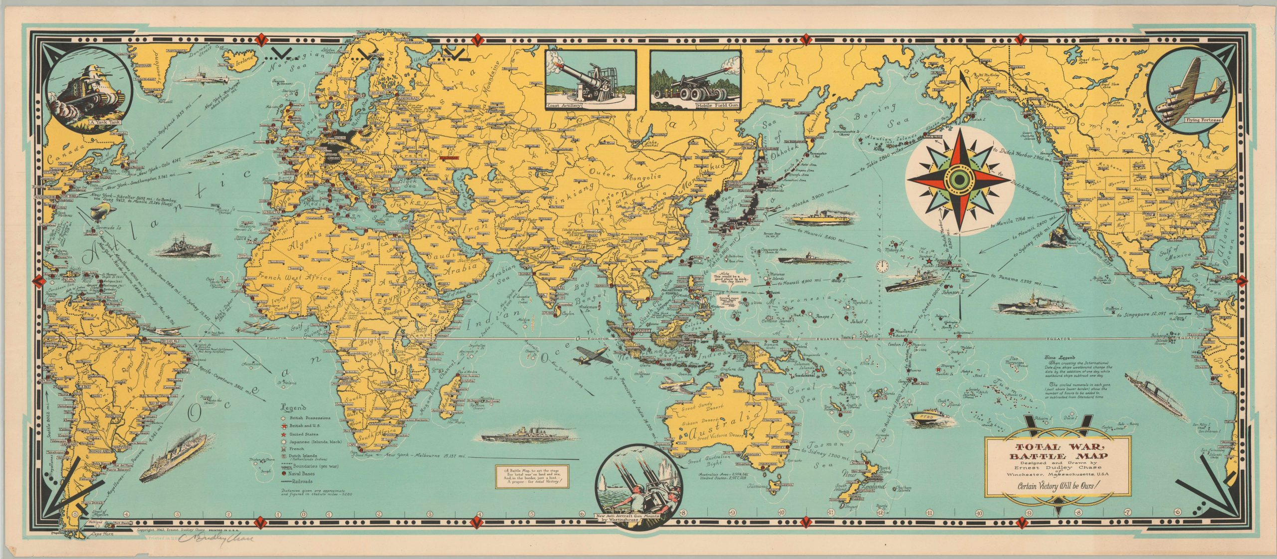
Take, for example, the Total War Battle Map, originally drawn and published by Ernest Dudley Chase in 1942. Using “Victory” as its cornerstone theme, (even though the outcome of the war was decidedly uncertain for most of 1942), the map portrays the global struggle in two tones – the black of the Axis-controlled territory (minus Vichy France) vs. yellow, representing the rest of the world.
Chase was a prolific commercial artist from Massachusetts who began his publishing career in the greeting card business in 1908. Overseeing the creative design department of Rust Craft, Chase supervised the design of thousands of greeting cards until his retirement in 1958. During this period, he also began to dabble in the creation of pictorial maps, riding the wave of public interest from the 1930’s. Most would take between six months and a year to complete, and by the outbreak of WWII, Chase was issuing a mail order catalog for his distinctive decorative images.

With the goal of map sales in mind, Chase published his Total War Battle Map less than a year after the U.S. entry into the conflict – likely in either September or October of 1942, based on the red ink used to differentiate active engagements on Guadalcanal and at Stalingrad. As mentioned above, the colors provide a visually staggering territorial advantage to non-Axis powers, even if they were officially neutral within the conflict. The legend identifies military bases, transportation routes, and pre-war international boundaries; while annotations throughout the map provide distances, historical information and even a touch of humor near the Philippines.


There are a few other aspects of the map that I’d like to draw to your attention.

A small box in the lower left provides a bit of background on its creation. “A Battle Map, to set the stage for “total war” on land and sea; and, in the border, just a hint – a prayer – for total Victory!”
The concept of ‘total war’ was almost entirely foreign to the American homefront, which experienced far fewer civilian casualties and domestic destruction than any other power. Yet the map is clearly calling for victory at any price, even early in the conflict before many of the atrocities were well known. It’s possible that Chase did not mean for non-combatants to be included in his call to arms, but unlikely.
The box also hints at a hidden message within the border. Three dots and a dash is the Morse Code symbol for “V” referencing, you guessed it, victory! Note that today’s peace sign gesture was popularized during the war as the “V” for Victory sign.
Several illustrations of equipment used by the Allies can be found around the border of the image. Though the “Yank Tank” is certainly antiquated, the vignettes reflect the tremendous material advantage that the United States enjoyed during the war. More so than any other American contribution, the mobile field artillery, long range bombers and aircraft carriers that would see the Allies emerge triumphant.

Chase’s signature can be found in pencil in the lower left corner. From what I can tell, this appears on every available copy of the 1942 Total War Victory Map. He was a popular cartographer at the time of publication, so this was possibly done by him in an effort to boost sales of the map’s first iteration.

There is also a small explanation about time, which references the International Date Line and the number of hours added or subtracted to local time zones. This concept would have been unfamiliar with many Americans who had little foreign interests prior to the war. But it still plays a role today, as V-J day is celebrated on August 15th (due to the time change) in Australia, the Netherlands and the United Kingdom.

Apparently, Chase’s map was popular, because he published a slightly different edition the following year, in 1943. Whereas the first map was printed on one side and sold rolled up, the second map was issued as a folded pamphlet. (A third would also be issued in postcard format). As such, Chase had an entire extra side of the page onto which he could add The Victory War Map, another pictorial originally drawn in 1942.

This smaller image uses similar color and form to showcase the North African and European theaters of war, which were at full tilt at the time of publication in 1943. Insignia of the Army, Navy, and Marine Corps can be seen in the border, while inset maps of the Mediterranean and the Italian peninsula highlight some of the theater’s most active combat areas.


Chase ended up creating several other maps throughout the course of the war, including one of the Pacific Theater; all using his same distinctive pictorial style. But his commercial success did not stop there. In a short biographical pamphlet published late in the war, Tim Thrift predicted:
“it is anticipated that many of the Chase maps – such as those for the British Isles, Italy, France, Germany, etc. – will be in great demand after the war by the men in our armed forces to show just where they had been, as the illustrations will mean much more than just pictures to them. They were in many of the buildings shown, saw the “points of interest” with their own eyes!”

This brings me to my original point, and the underlying theme behind each blog post this year about WWII – behind each map is a purpose, an audience, and the cultural framework in which it was created. Though hindsight has shown us that Allied victory was ultimately likely, even in 1942, at the time it was much less certain. Through the use of optimistic imagery and text, bright colors, and skewed data, Ernest Dudley Chase created a map that would provide hope for ultimate victory at a time when it was desperately needed on the homefront.
Two examples of the Total War Battle Map are available for sale on the website – the 1942 poster and 1943 pamphlet.
References
Hanson, V. D. (2020). The Second World Wars: How the first global conflict was fought and won. New York: Basic Books.
Hornsby, S. J. (2017). Picturing America: The golden age of pictorial maps. Chicago: The University of Chicago Press.
Thrift, Tim (1944). A Meticulous Map Mapker. Boston: Ernest Dudley Chase. Viewed online at Rumsey, Image # 8160002.jp2