I recently had the pleasure of joining friends in the Phoenix area for some Spring Training, March Madness, and desert sunshine. En route aboard Southwest Airlines, I was considering the ‘map’ placed on my tray table in the form of a disposable napkin. While the triangular diagram (missed opportunity for Delta!) may be well-known in marketing circles for its simple effectiveness, it also struck me that this may be one of the most reproduced maps of all time. Sure, it’s a very abstract map, but I am convinced that the presentation of spatial relationships between places fits the definition.
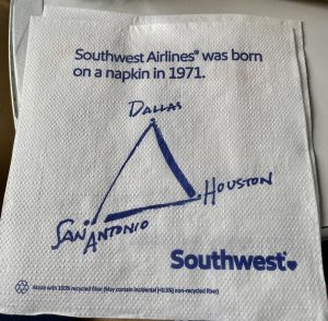
Image from Twitter of a different version. I lacked the foresight to take a photo on my flight.
According to the airline’s own statistics, Southwest served over 140 million passengers in 2024. I’d ballpark a conservative estimate of 250 million maps printed (1-2/customer/flight) for that year alone. Even considering different variants issued across the years of operation, the number of identical ‘route maps’ for a particular edition could theoretically exceed half a billion! I’ve put in an inquiry with the Southwest Marketing Department to see if they can help confirm the numbers and will update if I hear back.
So, what’s your best guess for the most ‘mass-produced’ map of all time? Feel free to drop me a line and share your thoughts!

Bonus Picture (my own): B-17 Sentimental Journey undergoing maintenance at the Commemorative Air Force Museum in Mesa, Arizona.